Three Projects, Three Completely Different Kinds of Work
Not every project in Hack Your Summer looks like the others. These three are from the same session, built in the same four weeks, and they have almost nothing in common except that each one started as an idea someone cared about enough to actually build.
Mapping Where Stroke Risk and Care Deserts Overlap
Every 40 seconds, someone in the United States has a stroke, and their chances of surviving and recovering well depend heavily on how quickly they can reach care. That gap between risk and access is exactly what the Stroke Burden Index was built to make visible.
Jane came in with a clear question: where do high stroke risk and poor access to care overlap worst? She posted the idea on day one, teammates joined within hours, and together the team — Jane, Cathleen, Mikko, Nitya, and Ngan — built a polished, publicly accessible site that scores all 91 counties across New York, New Jersey, and Connecticut on a combined index of stroke vulnerability and care access. The dashboard draws on data about local demographics, health risk factors, and distance from healthcare resources to surface the specific communities where public health intervention would have the highest impact.
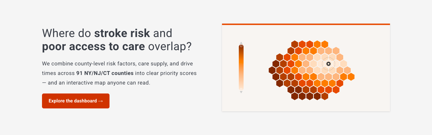
The Stroke Burden Index main page, accessible at https://palism1.github.io/stroke-burden-index/
The finding they published is specific and striking: 12 stroke care deserts — high risk and poor access — all in rural upstate New York. The results can support public health planning, healthcare resource allocation, stroke system planning, and future research by highlighting communities where targeted interventions may have the greatest impact.
The full site includes an interactive dashboard, a plain-language methodology page, a documented data pipeline drawing on CDC, Census, CMS (Centers for Medicare & Medicaid Services), HRSA (Health Resources and Services Administration), and state stroke registries, and a reproducible automated pipeline that keeps every number traceable. This is the kind of work that takes months in a research setting. This team shipped it in four weeks, documented it thoroughly, and made it publicly available for anyone to read.
A Free Store, Made Easier to Find and Use
Cleo is an Ada Comstock Scholar at Smith College, a program for non-traditional students returning to higher education as adults, where their focus is on critical disability studies and interdisciplinary design.
Cleo’s Hack Your Summer project didn't involve code. It didn't involve a dataset. It involved walking into Redistro, a mutual aid collective and free store in their community, and asking: what would it take to make this space genuinely welcoming and accessible to everyone who needs it?
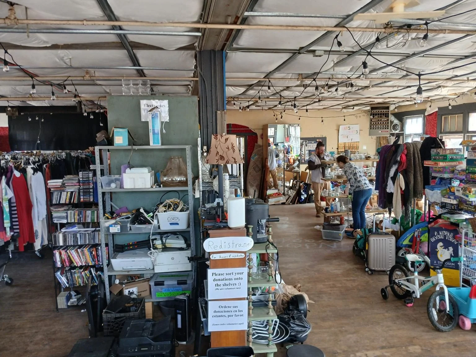
View of the interior at Redistro (photo via https://redistro.org/photo-gallery/)
The store is a real resource. But it's also hard to find on Google Maps, lacks signage, and can be difficult to navigate once you're inside. Cleo's project includes UX research through surveys and interviews with both visitors and organizers, a logo redesign for physical and digital wayfinding, exterior signage, and a full interior access map.
The plans for access mapping work alone are comprehensive: a physical map near the entrance, an audio guide with both conventional and QR code options, tactile elements, color-coded store sections with matching signage, and large-print versions of everything. Each of those is a design decision that requires thinking carefully about who the store actually serves and what barriers they face, rather than designing for a generic visitor who doesn't need any of it.
Cleo worked in Figma, ran accessibility surveys with store visitors, and coordinated directly with Redistro's organizers throughout. The project is scoped to continue well beyond the four weeks of HYS, with the program serving as the starting point for a longer-term design relationship with the organization.
Turning Litter Cleanup Into a Game
Early in the session, Ishi posted an idea for a sustainability project in our HYS Discord. Ella replied that same day, and by the end of the first week a team of four, Ishi, Ella, Trey, and Neha, had decided to build it together. Trey, a recent UNC grad in CS and Studio Art, brought UI/UX experience. Ishi, also at UNC, took the lead on the backend. The concept was simple enough to sketch on a napkin: what if picking up litter worked like Strava, with sessions, stats, streaks, and a reason to keep going?
The app they built is called Litter Quitter, a cross-platform mobile app that gamifies community litter collection. It runs on React Native and Expo, uses GPS to track cleanup sessions in real time, lets users drop pins at pickup locations with optional photos, and accumulates points redeemable for local business coupons. On the backend, the team is building out a FastAPI service backed by PostgreSQL to handle the shift from local device storage to a shared, persistent data layer.
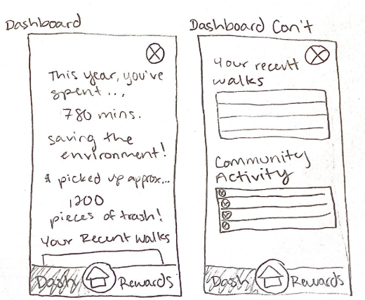
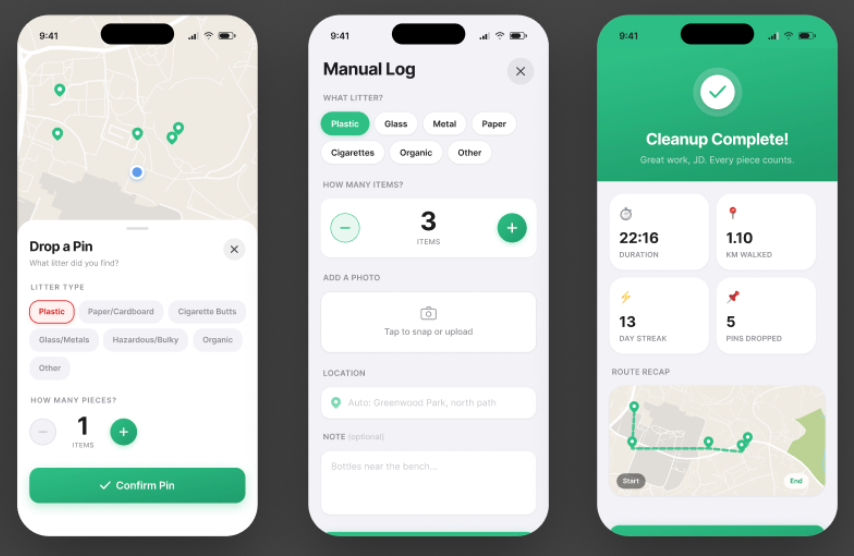
From napkin sketch to working prototype: early wireframes for the dashboard (left) alongside the current build (right), showing session stats, streaks, and recent walk history.
Personal stats, day streaks, community-wide impact totals, and leaderboards give users a reason to come back. The idea behind the rewards system is to loop in local businesses as partners, turning litter cleanup into something that benefits the whole neighborhood, not just the people picking things up. The team is actively working on bringing businesses on board, formulating interview questions and talking to potential users to understand what would make the partnership worthwhile on both sides.
By week three, the team had a working single-user prototype with a live map feature. Looking ahead, the team is also exploring a choropleth map that would shade neighborhoods by litter density, giving users a visual read on where cleanup efforts are needed most. The next problem was a hard one: How do you turn a working demo into a real multi-user platform with real data? That gap, from "it works on my phone" to "it works for everyone," is where a lot of apps stall out. The core of the idea is real enough to use and the team is still working through it as they continue with our second 4-week sprint.
The Stroke Burden Index, Redistro Accessibility Visioning, and Litter Quitter were all built during Hack Your Summer Session A, 2026.